Exploring a New Medium: Ceramics
Dear Reader,
Last year, I promised myself that I would try a new medium.
I did not feel pulled in any particular direction; I simply
wanted to try something new. The closest I came was the blast
of inspiration from visiting Antoni Gaudí's Parc Güell
in Barcelona (Judy's Journal-June 2008). The urge to go home,
smash all of my pottery, and create outdoor mosaics soon passed
when my right brain kicked in and reminded me how much I had
paid for it. Instead, I ended up making a series of fourteen
rollicking paintings which mimicked mosaics (Judy's Journal-August
2008). Making real ceramics did not seem like the "new"
medium I would be trying.
"New" is in quotation marks because it has been fifty
years since I glazed bisque forms and had them fired. During
four years of high school studio classes, we worked with every
medium, even those recently developed paints called acrylics.
I recall not being enamored with ceramics for the very reason
I ended up becoming a painter: my joy comes out of the tubes,
onto the palette, gets mixed, and used. My impatience and need
for instant gratification makes me favor the "colorito"
method of painting. I also work with oil sticks, a medium which
allows me to even skip the palette and mix colors directly on
the support! To draw, then color in with paint, "disegno,"
just isn't my process. Working with glazes frustrated me in
the extreme because I could not see the colors until the piece
was fired. I was not called to become a ceramics artist.
Not until last month. My brother, Al, passed away in late February,
leaving us heart-broken and devastated. He was doing what he
could to help redo the kitchen with his wife, Barbara, and her
sister-in-law, Terry. One day, he went to the hospital for a
procedure and died shortly after it was completed. The chaos
of the kitchen could not match what we felt when we lost him..
One of the decorative ideas Barbara and I had talked about
was to float several ceramic tiles on the painted backsplash.
Since my husband and I were going to Portugal for a week in
March, I said I would look for colorful tiles to compliment
the wall paint (ochre warmed up with red, inexplicably called
"Apple Crisp"). The requirements were: warm colors,
an abstract pattern, no blue.
John and I went, searched and did not find the above ceramic
tiles. This was amazing to us, since Portugal is the second
largest exporter of tiles (after Turkey) in the world.
On the flight home, I asked myself, "Could I make the
tiles?" I did not remember much about my high school experience
when I had that thought, but the body has a strange and wonderful
way of storing memory. It all came back when I sat down at a
table in the studios of Clay Time in Shrewsbury, Massachusetts
(www.claytimestudio.com). I wore one of Al's shirts each day
I worked there. It became part of my mourning for him. I was
testing the axiom: Art Heals.
Writing heals, too. From the first day the project started,
I knew that I would need to use this journal to explore my return
to ceramics. It was a strong and positive experience in so many
ways. The Clay Time staff, Becca, Christine, Kerry, and the
owner, Laurel, made me feel welcome and guided me through the
project with respect and patience.
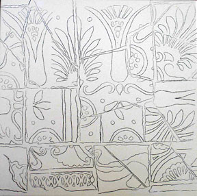
After selecting the bisque tiles, my first step would be to
make the designs. Antoni Gaudí to the rescue! I scanned
close-up photographs of the bench at Parc Güell and printed
them in grayscale. I needed to delete his original riot of colors,
because I would be substituting a restricted palette of reds,
yellows and browns.
I returned to Clay Time for my first work session. Becca supplied
me with transfer paper to trace the images onto the bisque tiles,
small tiles that corresponded to the glazes, and the metal tip
bottles of glaze. After tracing the intricate designs onto the
seven tiles (3 three inch and 4 eight inch squares), I was ready
to begin applying the glazes. I worked for six hours that day
and did not move or blink.
And then I remembered why I became a painter, not a ceramicist.
What IS this? It was déjà vu all over again. I
felt as if I were flying (color)blind. Becca assured me that
once I became more experienced, my brain would translate the
mauve and beige colors into reds, yellows and browns.
My curiosity kicked in. I wanted to see what would happen.
Days passed in the clay studio. I was obsessed. I was in a trance.
I had drawn or traced the shapes, now I was filling in with
color (well, not exactly, but I had to use my imagination) -
I was painting in two steps - disegno - like a Florentine, not
a Venetian!
And then came the hardest part: waiting to have the pieces
fired. Talk about pressing my instant gratification button!
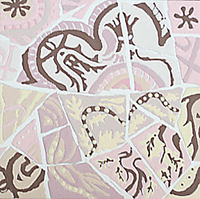
Agony. And then one day, while I was working on the larger tiles,
Becca brought me the 3 fired small ones. Shock! My brain was
still expecting the mauve and beige colors of unfired glazes.
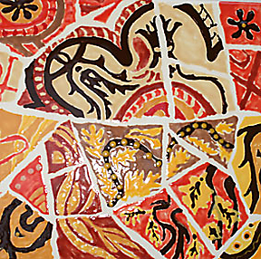
What worked?
1. The abstract designs are super effective! Now to decide the
directions to situate them, so the set of three will have an
overall pleasing effect. Let's do the math: how many combinations
will the squares have and where is left, right and middle?
2. The effect of the unglazed "breaks" that mimicked
grout between the broken "pieces" looks terrific.
When I made my Landscape Mosaic painting series, I had to work
with pencils and inks to get the grout effect. There is one
step less when making these ceramic tiles.
3. It was crucial to stay with one group of (warm) colors, so
that the designs for the set could be read with some consistency.
Given the sizes, 3" and 8" squares, and the complexity
of the designs, too many colors could cause confusion. Welcome
to the decorative arts!
What needs work?
1. There seems to be an unevenness on the solid areas. Should
I have used other glazes and/or brushes instead of metal tips?
2. The dark edges are ragged. At first I was disappointed in
this, but then I realized that I would not be breaking perfect
ceramics to use in mosaics. I would be looking for imperfect
pieces. Potters have lots of them. I have mimicked the flawed
pieces.
3. I need to take more breaks while working. This is intense
and close work.
I gladly took the risk of failing in doing this project.. As
Donald M. Murray said, "That's what artists do." Someone
looking for a finished, elegant looking set of tiles might say
that I failed. As I write this, I do not know whether or not
these brightly-colored squares will end up in Al and Barb's
kitchen. If they do, that could be seen as a mark of success.
If they do not, their success will lie in how much the experience
has taught me. On the surface, I learned about making ceramics,
but I also learned another way to mourn the loss of my brother.
judy@paletteandpen.com