The little O, the earth: Travel Journals, Art & Poems
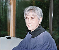
Dear Reader,
This is a cause for celebration – the June launch of my book, a collection of work focused on one of my passions: travel!
Two years ago, I decided it was time to look at 10 years of Judy’s Journals, gather those which dealt with travel, and see where it led me. I had a vision, really a dream: my hands holding a square book about travel. Inside would be pages filled with journals, some artwork and poems. The image was intentionally fuzzy, because I knew challenges and surprises were waiting to happen. Experience being the best teacher, I also knew that a project like this would take years.
THE JOURNALS
In 2012, I made hard copies of twenty-one travel-themed Judy’s Journals, which were written between November 2004 and May 2012. The good part happened quickly – reading each one triggered vivid memories and returned me to places such as Barcelona, Reykjavik and Palermo! The challenge dawned gradually, as I realized that heavy doses of revisions would be required. Revision should be done in phases, and a writer’s best friend is time. I worked on the journals, then let months go by and did it again. And again. The serious, no-holds-barred revision would come after the first of this year. Good decision: Worcester ended up being the snowiest city in the United States (120 inches). I kept to a schedule, taking breaks to help move snow, eat and sleep. See the film The Turin Horse, and you will understand our emotional landscape.
THE ARTWORK
Because of the long-term journal revision process, my brain was immersed in travel. I would need to create artwork that offered readers a visual journal to complement the written. I had worked through my “Autobiography” series (Judy’s Journal, 2011 September) and looked forward to this new iteration’s lessons. My materials would be image transfers, archival ink and pencil on 8-inch square clay board. Next, I listed places John and I had visited and researched twenty-one indigenous artists’ black and white works. After choosing one from each artist, I transferred them onto clay boards (Rembrandt, van Gogh, Matisse). I surrounded each image with ink and pencil designs that grew from memories (Amsterdam – canals, Lisbon – stone walls, Germany – architectural designs). I worked from February 2012 through April 2013. As the book took shape, I realized a brief written text would be needed to accompany each artwork. I added that to my list of “things to do.”
THE POEMS
One day, I took a break from revision and art to gather my travel-themed poems. Some were written decades ago and others were more recent (a.k.a. needing revision). The striking thing was the number of poems that emerged: twenty-one. Sometimes, there are coincidences and other times, it seems as if another force is at work.
THE TITLE
The book was taking shape, but was without a title. Titles are telegrams of meaning and creating them might seem easy. I wish someone would write a book about where titles come from. Here is the story behind The little O, the earth: Travel Journals, Art & Poems. John and I were planning a long car ride together, and he suggested listening to CDs to pass the time. He had just purchased a set that analyzed Shakespeare’s plays. Antony and Cleopatra came up around Syracuse, and we were held in the thrall of their passion and politics. I heard this passage from Act V and was overcome not only by her love for Antony, but her description of the earth.
His face was as the heavens; and therein stuck
A sun and moon, which kept their course,
And lighted
The little O, the earth.
There was the title for my travel book! I asked John to write it down for me. What a gift!
THE COVER
The first artwork in the travel series integrated an image of the church in the center of Vallelunga Pratameno, Sicily, the town where my maternal grandparents were born. It was an early decision to have it on the cover. What would the background color be? I could continue the black and white scheme of the book’s contents. Gray? Black with white borders? I asked my sister, Jennie, and she said, “Why not have it be the color of the special glaze that Sicilian potters use?” Vermillion! Perfect. What a gift!